Samanage - main preview upgrade
Samanage company provides a service desk for IT and any other department,
that is as usable as it is cutting-edge.
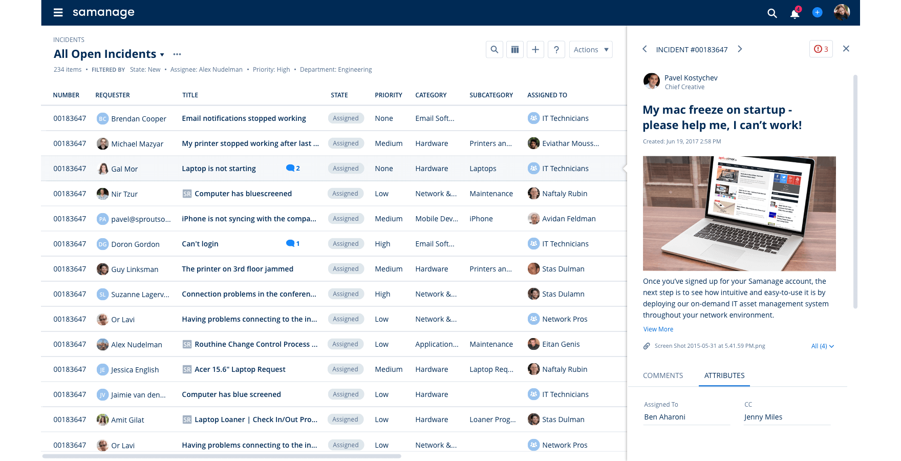
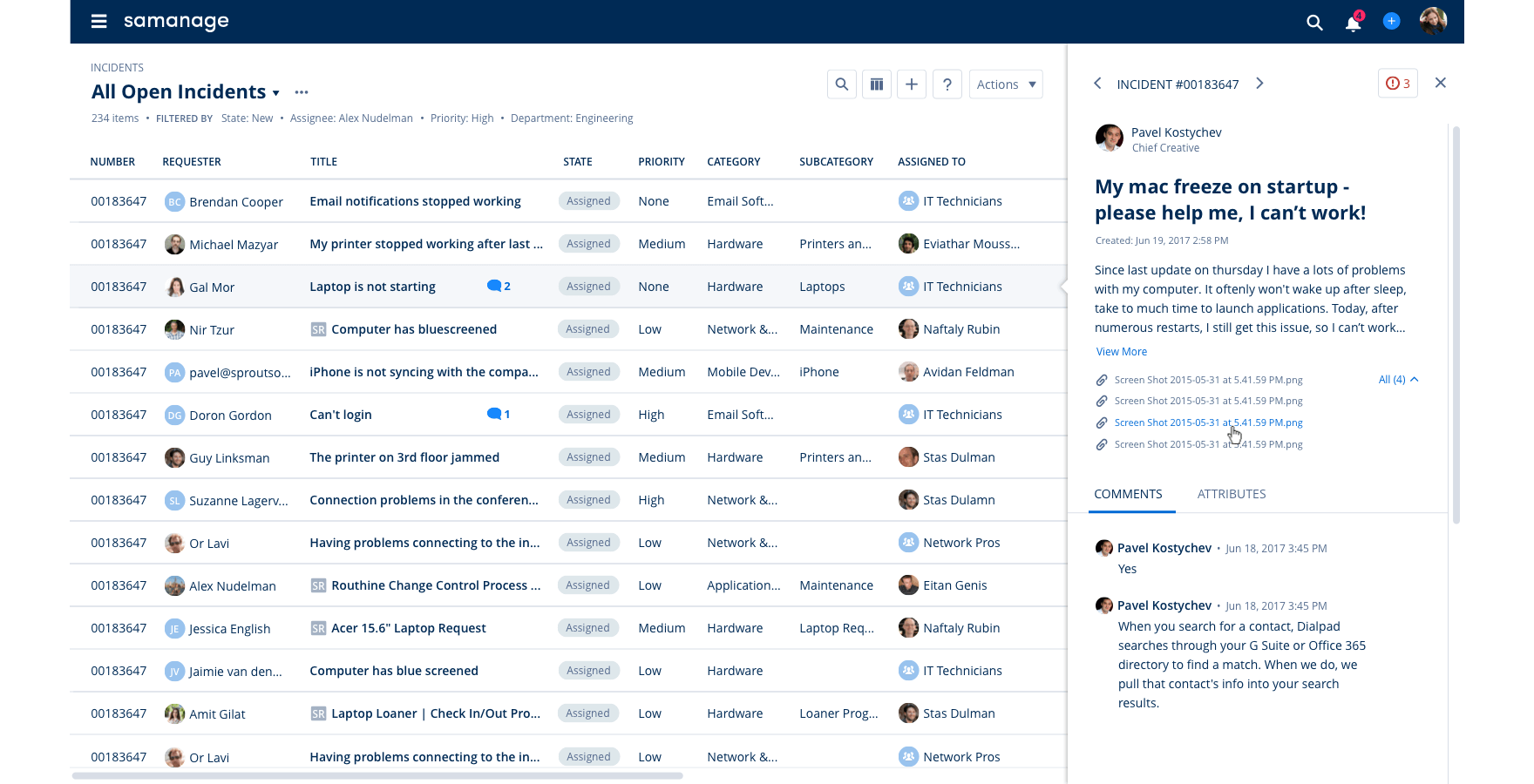
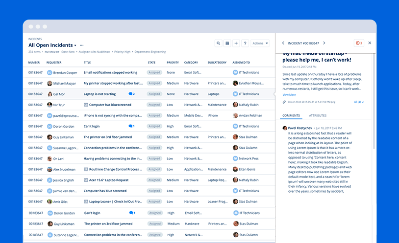
The main preview is located in one of the key screens of the product.
The inline preview displays the most important information of an "incident" and allows taking critical actions
without leaving the main table page.
Therefore, saving precious time and creating a more efficient workflow.
My Role: Main designer, in charge of the UX/UI and design
Created: 2018
Samanage - main preview upgrade
Samanage company provides a service desk for IT and any other department,
that is as usable as it is cutting-edge.
The main preview is located in one of the key screens of the product.
The inline preview displays the most important information of an "incident" and allows taking critical actions
without leaving the main table page.
Therefore, saving precious time and creating a more efficient workflow.
My Role: Main designer, In charge of the UX, UI, and design
Created: 2018

The problem
The old preview revealed only part of the incident’s important inner information and didn't allow the users to perform any actions directly from that screen, instead they had to click and enter the incident page in order to take action.
The old preview revealed only part of the incident important inner information. Also, it didn't allow the users to perform any actions directly from it, So they had to click and enter the incident page.
A sneak peek to the UX/UI and design process
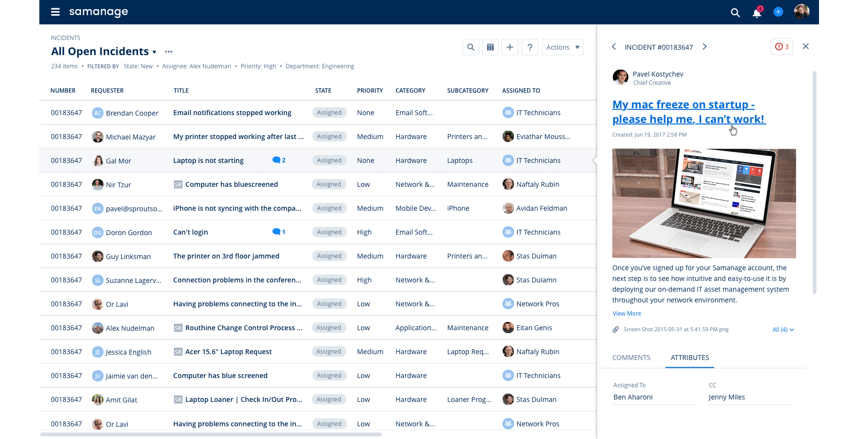
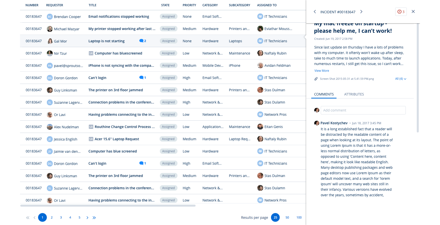
Header scroll
During the process, I worked closely with the product team.
We had meetings with clients that use the preview excessively during their workday and
asked for their feedback, making sure we are answering all their needs.
Below is an example of the header evolution I created during the process.
Since the table and the page already have a scroll I suggested that the preview will be full-width,
the reasoning for this suggestion was to avoid having 3 scrolls that might complicate the user's experience.
Header scroll

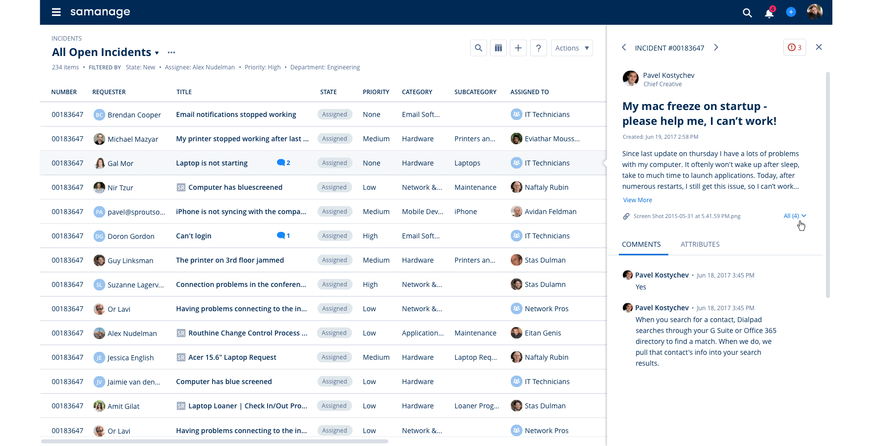
Actions menu
Creating the preview as a sticky panel meant that we had to find a new position for the page actions.
I also had to find an elegant way to allow current and future actions within the preview itself.

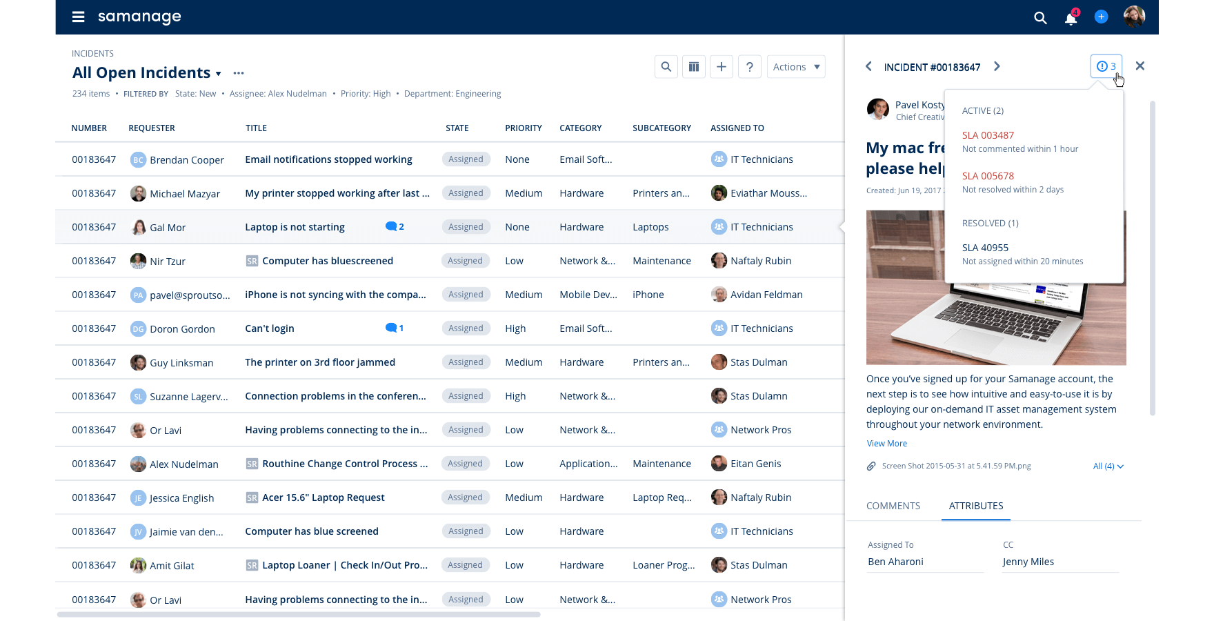
Approvers list
This list shows the stages of approval required for this task and the current status.
The list didn't appear previously in the preview pop-up,
but the product team and I decided that it's important enough to appear.
I suggested adding in the future an option for authorized users
that will allow to approve or to decline directly from the preview.

The solution
With this new preview, users can navigate between incidents and perform many actions
without leaving the main page. I used the same components through different
types of table pages to maintain a consistent style throughout the product.
