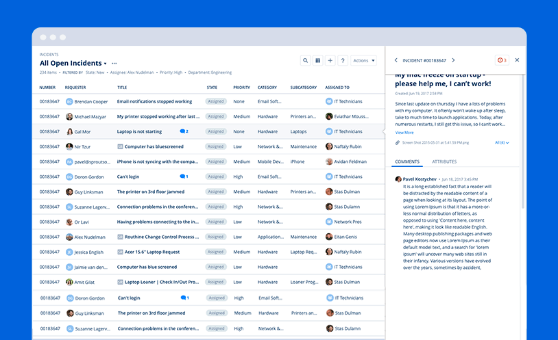
Samanage - service catalog
Samanage company provides a service desk for IT and any other department,
that is as usable as it is cutting-edge.
The new service catalog goal is to offer a better and easier way to view and order companies services,
while maintaining a consistent design language.
My Role: Main designer, in charge of the UX/UI and design
Created: 2018

The problem
The old service catalog lacked a constructed navigation. Some of the options in each category were hidden, forcing the users to guess where they are.
Options - Wireframes
First I tested a few layout design options and ran them by my manager for feedback.
To maintain a consistent style throughout the system
I used elements from the company's style guide for most of the work,
but I also inserted new necessary elements that I knew would be effective in other parts of the system.


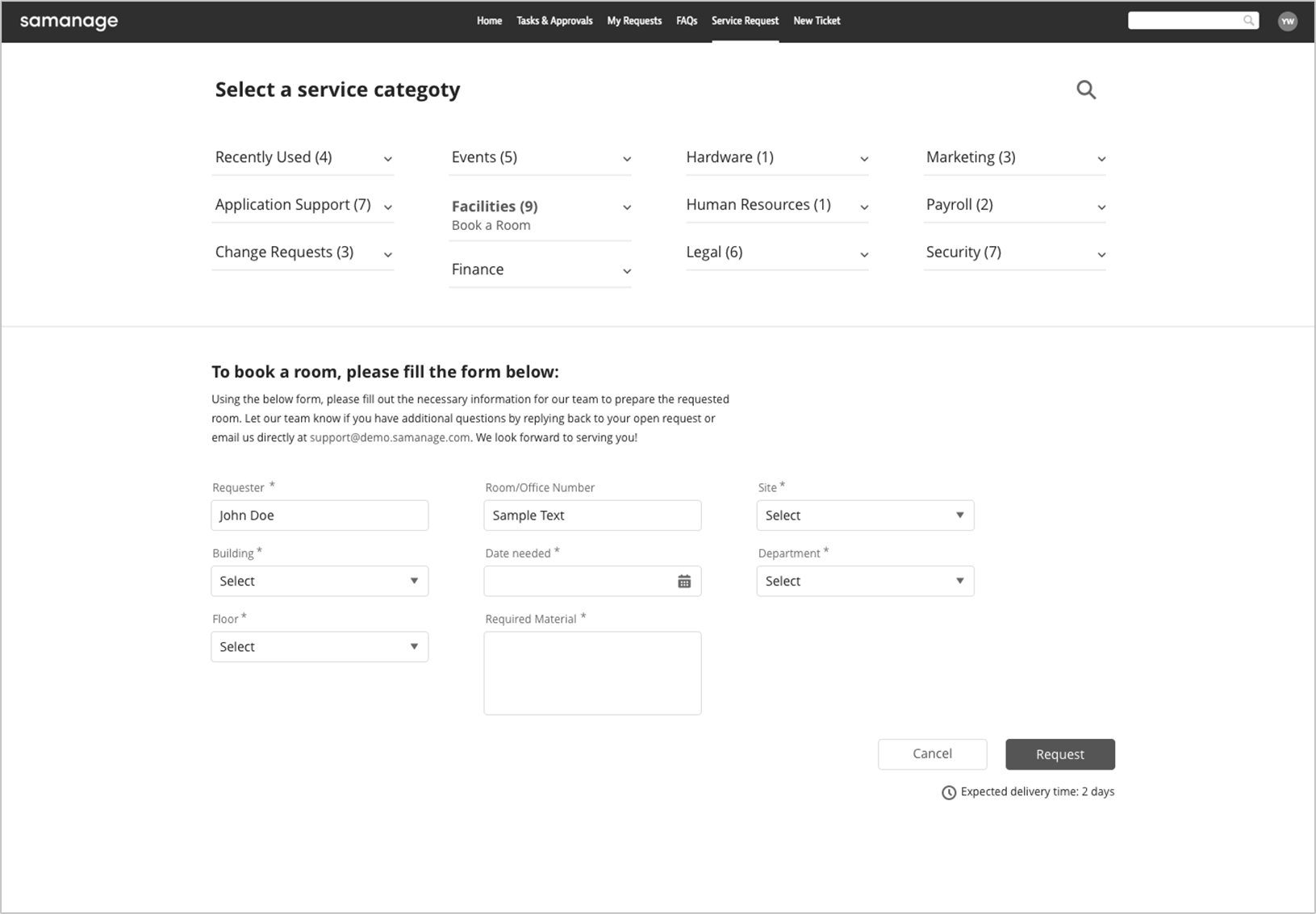

Wireframes stage 2
After we decided on the best option, the one that will be the most efficient for the users,
I met with the development team to gain a deeper understanding of our limitations and obligations.
Following the conclusions of those meetings, I started cleaning and adjusting the UI.


The solution
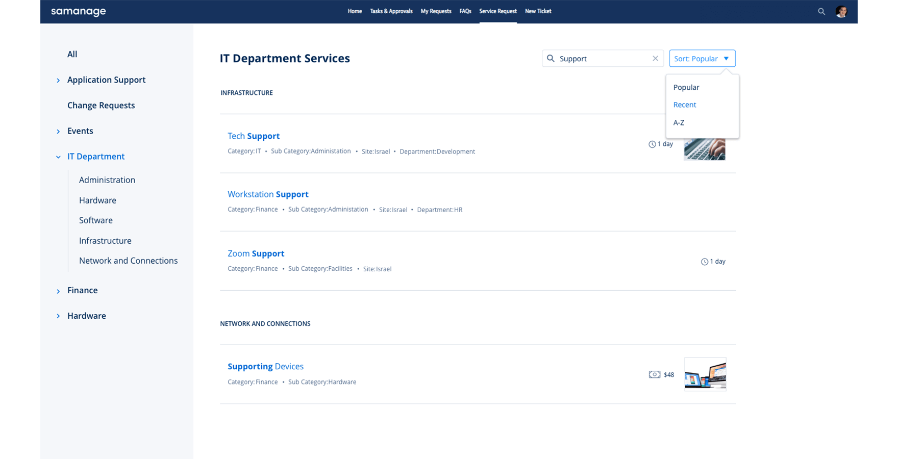
Creating a clean and welcoming main page with side navigation and filter options.
Many important parameters, such as category, site or cost are now visible right away,
thus making it easy to view and order different services.
Aiming to create a clear hierarchy,
my design gave special attention to white spaces and typography,
while maintaining loyalty to the company's detailed style guide.


